April 2011
This month's newsletter takes a look at correlation analysis. Correlational studies are done to look at the linear relationships between pairs of variables. There are basically three possible results from a correlation study: a positive correlation, a negative correlation or no correlation. These are described below. A scatter diagram is often used to visually see the relationship between the two variables. A scatter diagram matrix can be used to see the relationship between multiple pairs of variables. This newsletter will demonstrate how to calculate the correlation coefficient and determine the probability that it is statistically significant.
In this issue:
- Positive Correlation
- Negative Correlation
- No Correlation
- Correlational Relationships and Causal Relationships
- Example: Smoking and Lung Cancer
- Scatter Diagrams
- Pearson Correlation Coefficient
- When is R Significant?
- Impact of Outliers
- R Squared and R
- Final Cautions on Correlation Analysis
- Quick Links
A word of caution to start with: a significant correlation between two variables does not mean that one is the cause of the other. This is the difference between a "correlational" relationship and a "causal" relationship.
Please feel free to leave comments at the end of the newsletter.
Positive Correlation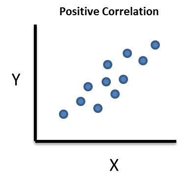
A positive correlation exists between variable X and variable Y if an increase in X results in an increase in Y (and vice-versa).
- The more cigarettes you smoke, the greater the chance of lung cancer.
- If you are paid by the hour, the more hours you work, the more pay you receive.
- The more time you spend studying, the better grades you make in school.
Negative Correlation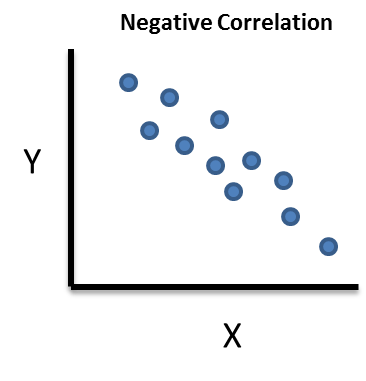
A negative correlation exists between variable X and variable Y if a decrease in X results in an increase in Y (and vice-versa).
- The heavier your car is, the lower your gas mileage is.
- The colder it is outside, the higher your heating bill.
- The more time you spend watching TV, the lower your grades are in school.
No Correlation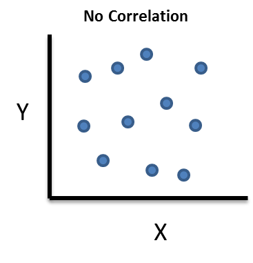
In this case, a change in X has no impact on Y (and vice-versa). There is no relationship between the two variables. For example, the amount of time I spend watching TV has no impact on your heating bill.
Correlational Relationships and Causal Relationships
It is important to remember that simply because there is a significant correlation between two variables, it does not mean that one is the cause of the other. Suppose we find a significant correlation between X and Y. We know the association exists, but not necessarily the direction of that association:
- Does a change in X cause a change in Y?
- Does a change in Y cause a change in X?
But, to complicate things even more, there may be a third, unmeasured variable (Z) that is actually the cause of the change.
- Does a change in Z cause a change in both X and Y?
Jeffery Ricker has a good discussion of this. I will summarize what he says here. A study was done in 2005 to determine the impact of where students sit in a classroom to the grade they received. The study indicated that students who sat up front received better grades than those who sat in the back of the room. The seats were assigned at random. A follow-up study in 2007 by others offered a different way to interpret the results. This is how Dr. Ricker explains it:
"In the correlation between classroom seat location and course grades, it could be that
- sitting in front (Variable A) causes students to get better grades (Variable B),
- getting better grades (Variable B) causes students to sit in front (Variable A), or
- being more motivated (an unmeasured third variable, C) causes students both to sit in front (Variable A) and get better grades (Variable B)."
The key point is that is impossible just from a correlation analysis to determine what causes what. You don't know the cause and effect relationship between two variables simply because a correlation exists between them. You will need to do more analysis (such as designed experiments) to define the cause and effect relationship.
Example: Smoking and Lung Cancer
The example involves a study done in England to look for a correlation between smoking and lung cancer. Twenty-five occupational groups were included in the study. The X variable is the number of cigarettes smoked per day relative to the number smoked by all men of the same age. If X = 100, then the men smoked an average amount; if above 100, the men smoked more than average and if below 100, they smoked less than average.
The Y variable is the mortality ratio for deaths from lung cancer. Again, if Y = 100, then the morality ratio for deaths from lung cancer for that group was average; above 100 it was greater than average and below 100 it was less than average. The data are shown below. We will use this data to do a correlation analysis of smoking and mortality.
|
Occupational Group |
Smoking |
Mortality |
|
Farmers, foresters, and fisherman |
77 |
84 |
|
Miners and quarrymen |
137 |
116 |
|
Gas, coke and chemical makers |
117 |
123 |
|
Glass and ceramics makers |
94 |
128 |
|
Furnace, forge, foundry, and rolling mill workers |
116 |
155 |
|
Electrical and electronics workers |
102 |
101 |
|
Engineering and allied trades |
111 |
118 |
|
Woodworkers |
93 |
113 |
|
Leather workers |
88 |
104 |
|
Textile workers |
102 |
88 |
|
Clothing workers |
91 |
104 |
|
Food, drink, and tobacco workers |
104 |
129 |
|
Paper and printing workers |
107 |
86 |
|
Makers of other products |
112 |
96 |
|
Construction workers |
113 |
144 |
|
Painters and decorators |
110 |
139 |
|
Drivers of stationary engines, cranes, etc. |
125 |
113 |
|
Laborers not included elsewhere |
133 |
146 |
|
Transport and communications workers |
115 |
128 |
|
Warehousemen, storekeepers, packers, and bottlers |
105 |
115 |
|
Clerical workers |
87 |
79 |
|
Sales workers |
91 |
85 |
|
Service, sport, and recreation workers |
100 |
120 |
|
Administrators and managers |
76 |
60 |
|
Professionals, technical workers, and artists |
66 |
51 |
Scatter Diagram
It is always best to begin with a scatter diagram of the data to get a visual picture of the relationship. For more information on scatter diagrams, please see our February 2005 newsletter. A scatter diagram simply plots the Y variable versus the X variable. The scatter diagram for the smoking data is shown below.
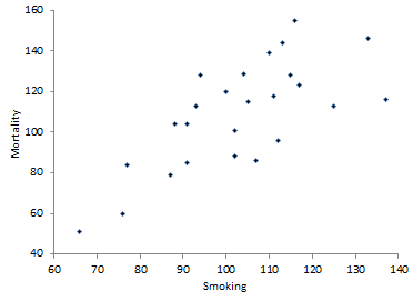
The scatter diagram does appear to show a positive correlation. The mortality rate appears to increase as the smoking ratio increases. In addition to this visual picture, it would be nice to have a numerical measurement of this correlation. This is done by calculating the correlation coefficient.
Pearson Correlation Coefficient
The Pearson correlation coefficient (or just correlation coefficient) provides a measure of the correlation between two variables. The equation for the correlation coefficient is given below.
where Xi and Yi are the individual paired data points, n is the total number of paired data points, Xbar is the average X value, Ybar is the average Y value, and sx and sy are the standard deviations of the X and Y values respectively.
If R is positive, then there is a positive correlation between X and Y. What makes R positive? Look at the numerator in the R equation:
If an X value is above average and the paired Y value is above average, then the numerator is positive. If an X value is below average and the paired Y value is below average, you would be multiplying two negative numbers - which again gives a positive number. So, in a positive correlation, large value of X tend to generate large values of Y and small values of X tend to generate small values of Y.
If R is negative, then there is a negative correlation between X and Y. What makes R negative? Again, look at the numerator in the R equation above. If an X value is below average and the paired Y value is above average, you will be multiplying a negative number by a positive number - which generates a negative number. If an X value is above average and the paired Y value is below average, you will be multiplying a positive number by a negative number - again generating a negative number. So, in a negative correlation, large values of X tend to generate small values of Y and vice-versa.
The calculation of the correlation coefficient is straightforward based on the equation above. The calculations are shown in the table below.
|
Smoking (X) |
Mortality (Y) |
(X-Xbar)*(Y-Ybar) |
|
|
77 |
84 |
647 |
|
|
137 |
116 |
238.84 |
|
|
117 |
123 |
197.68 |
|
|
94 |
128 |
-168.72 |
|
|
116 |
155 |
603.52 |
|
|
102 |
101 |
7.04 |
|
|
111 |
118 |
73.08 |
|
|
93 |
113 |
-39.52 |
|
|
88 |
104 |
74.4 |
|
|
102 |
88 |
18.48 |
|
|
91 |
104 |
59.4 |
|
|
104 |
129 |
22.4 |
|
|
107 |
86 |
-94.76 |
|
|
112 |
96 |
-118.56 |
|
|
113 |
144 |
354.2 |
|
|
110 |
139 |
213.6 |
|
|
125 |
113 |
88.48 |
|
|
133 |
146 |
1114.44 |
|
|
115 |
128 |
230.28 |
|
|
105 |
115 |
12.72 |
|
|
87 |
79 |
476.4 |
|
|
91 |
85 |
285.12 |
|
|
100 |
120 |
-31.68 |
|
|
76 |
60 |
1317.12 |
|
|
66 |
51 |
2139.04 |
|
|
Sum |
2572 |
2725 |
7720 |
|
Average |
102.88 |
109 |
|
|
St. Dev. |
17.198 |
26.114 |
R can now be calculated:
![]()
The R value is positive indicating a positive correlation. This confirms what the scatter diagram shows.
When is R Significant?
You have your scatter diagram and the value of R. Is the correlation significant? In other words, does it mean anything to you in the real world? Some people give guidelines for interpreting R. For example:
| R | Strength |
| -1.0 to -0.5 or 1.0 to 0.5 | Strong |
| -0.5 to -0.3 or 0.5 to 0.3 | Moderate |
| -0.3 to -0.1 or 0.3 to 0.1 | Weak |
| -0.1 to 0.1 | None |
The author does note that others may question his boundaries. They are somewhat arbitrary. It is much better to determine the "p value" to help you determine if the correlation is significant. A p value is the probability of getting something more extreme than your result, when there is no correlation between the two variables. The p value is calculated using the t distribution where:
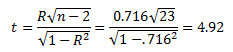
You can then use the t distribution to find the probability associated this value of t for 23 degrees of freedom. In Excel, use the TDIST function. The value of p is then:
p = 0.000057
This is the probability that you would obtain a result more extreme than the 0.716 if there was no correlation between the two variables. Since this value is so small, you assume that there is evidence of a correlation between the two variables.
Many researches assume there is a statistically significant correlation if p <= 0.05. If the value of p>=0.20, there is no correlation. If the value falls between 0.05 and 0.20, more data are needed.
Impact of Outliers
Outliers in the data (special causes of variation) can sometimes mask the results. That is why it is important to construct a scatter diagram to look for outliers. You can also use a Box-Whisker chart to look for outliers (see our March 2007 newsletter). Suppose you have the data set below and you want to see if there is correlation between X and Y.
| X |
Y |
| 4 | 12 |
| 3 | 10 |
| 9 | 2 |
| 12 | 20 |
| 8 | 4 |
| 3 | 12 |
You could calculate the correlation coefficient and the p value. If you do that, you get the following results:
R = 0.116
p = 0.826
Since p is so large, you conclude there is no correlation between X and Y and go happily on your way. The scatter diagram for the two variables is shown below. Note the outlier in the upper right corner.
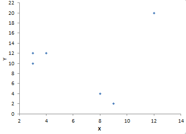
Since this is so far removed from the rest of the data, it may be an outlier. So, do you just toss the point out and redo the calculations? No, you should not just assume that is an outlier. You need to find out if there was a special cause of variation. If you find the reason for the outlier, you may toss the point out. If not, you probably need to consider taking more data. If you deleted the point from the calculations, the results are:
R = -0.962
p = 0.009
So, there is a strong, negative correlation. These data were just to demonstrate the impact of outliers. You normally would not do a correlation analysis with these few data points. You should always strive to have as much data as possible to do a correlation analysis.
R-Squared and R
You can multiply R by itself and get R-Squared. This is the term that is often used in regression analysis. It gives the % of variation in Y that is explained by the variation in X. In the lung cancer example, R-squared is 0.513. This means that 51.3% of the variation in lung cancer mortality is explained by the variation in the smoking ratio.
Final Cautions on Correlation Analysis
A couple of quick cautions on correlation analysis. A significant correlation does not prove causation. You will need to do more work to prove that in most cases. Correlation is looking only at linear relationship between the variables. And last, your analysis is valid only for the range of data you used. There may be a different result if you use a different range of data.
Quick Links
Thanks so much for reading our publication. We hope you find it informative and useful. Happy charting and may the data always support your position.
Sincerely,
Dr. Bill McNeese
BPI Consulting, LLC
![]()
Connect with Us
SPC Knowledge Base

Sign up for our FREE monthly publication featuring SPC techniques and other statistical topics.
Customer Stories
Click here to see what our customers say about SPC for Excel!
SPC Around the World
SPC for Excel is used in 80 countries internationally. Click here for a list of those countries.
Comments (6)
What are additional important statistical approaches which could make the basic statistical process control (SPC - covering concepts and examples and applications of 7 control charts) program become more advanced in in-depth applications?
Not sure what you mean by more advanced in-depth applications. In terms of defining a cause and effect relationship, experimental design techniques are very valuable. These controlled experiments do usually produce the cause and effect relationship.
Thank you for the easily understood discussion of the risks in assuming causality when correlation exists. If anything I would ask you to emphasis this even more since the human tendency is so strong.
I was a little thrown off by your sentence that "The seats were assigned at random." It increases the desire to attribute the correlation to a primary cause, and IMHO directly contradicts the provided example of a third variable.
You are, of course faithfully reporting what is written. While this a more true statement of the study's history I find it detracts from the directness and clarity that I've always appreciated in these newsletters.
Or was this perhaps a subtle ploy to lead us into temptation ?
Thanks for the feedback. I thought a while about using the example of students sitting in the front of the class and the grade they make. The first study found a correlation - the second didn't. I have in the past used the good old example of the stork population increasing along with the number of babies born. Simpler example of correlation and causal relationships, but the student one was interesting to me. Thanks for reading the newsletter.
Dear Mr.William McNeese
Hats off to you for your contribution to the world through wonderful news letter you publish.This is written so nicely with illustations which will make any body to understnd the same.
Thank you very much
Aravind
Corporate head-Systems &audit
Karle group of companies
Bangalore-India
Very nice Statistics 101. Always good to get a refresher! Thank you.
Leave a comment