July 2018
(Note: all the previous publications in the "Root Cause Analysis" category are listed on the right-hand side. Select "Return to Categories" to go to the page with all publications sorted by category. Select this link for information on the SPC for Excel software. This publication was originally published in Feb 2005. It was updated in July 2018 with more information and graphics.)
 Suppose you are faced with a problem. You have followed the steps in your problem-solving model. You have defined the problem using Pareto diagrams and pinpointing. In addition, you have analyzed how the process is behaving using process flow diagrams, histograms and control charts. The process is in control, but the results are not acceptable. There is too much variation in the process (or perhaps it is operating at the wrong level or average).
You need to find out what is causing the process to behave as it does. A cause and effect diagram has been constructed. This diagram lists some the possible causes of the problem. How do you determine what causes are responsible for the variation? For example, is reaction yield influenced more by run time or pressure? One method of doing this is to use a scatter diagram. The scatter diagram is introduced in this publication.
In this issue:
- Introduction to Scatter Diagrams
- Interpreting a Scatter Diagram
- Is the Correlation Statistically Significant?
- Is the Correlation Useful to Us?
- Scatter Diagram Example
- Summary
- Quick Links
You can download a copy of this publication at this link. Please feel free to leave a comment at the bottom of this page.
Introduction to Scatter Diagrams
A scatter diagram is used to show the relationship between two kinds of data. It could be the relationship between a cause and an effect, between one cause and another, or even between one cause and two others. To understand how scatter diagrams work, consider the following example.
Suppose you have been working on your process of getting to work within a certain time. The control chart you constructed on the process shows that, on average, it takes you 25 minutes to get to work. The process is in control. You would like to decrease this average to 20 minutes. What causes in the process affect the time it takes you to get to work? There are many possible causes, including traffic, the speed you drive, the time you leave for work, weather conditions, etc. Suppose you have decided that the speed you drive is the most important cause. A scatter diagram can help you determine if this is true.
In this case, the scatter diagram would be showing the relationship between a "cause" and an "effect." The cause is the speed you drive, and the effect is the time it takes to get to work. You can examine this cause and effect relationship by varying the speed you drive to work and measuring the time it takes to get to work. For example, on one day you might drive 40 mph and measure the time it takes to get to work in minutes. The next day, you might drive 50 mph and measure the time it takes to get to work. After collecting enough data, you can then plot the speed you drive versus the time it takes to get to work. Suppose you collected the data given in Table 1.
Table1: Time to Get to Work and Speed Data
| Speed | Time | Speed | Time | |
|---|---|---|---|---|
| 64 | 17 | 48 | 29 | |
| 62 | 23 | 59 | 14 | |
| 51 | 26 | 57 | 18 | |
| 46 | 28 | 50 | 22 | |
| 52 | 27 | 45 | 23 | |
| 51 | 28 | 47 | 32 | |
| 57 | 20 | 46 | 22 | |
| 60 | 14 | 61 | 24 | |
| 55 | 17 | 54 | 25 | |
| 51 | 21 | 53 | 24 | |
| 64 | 15 | 45 | 31 | |
| 60 | 24 | 54 | 25 | |
| 61 | 19 |
Figure 1 is an example of a scatter diagram for this case. The cause (speed) is on the x-axis. The effect (time it takes to get to work) is on the y-axis. Each paired set of points is plotted on the scatter diagram.
Figure 1: Time to Get to Work vs Speed
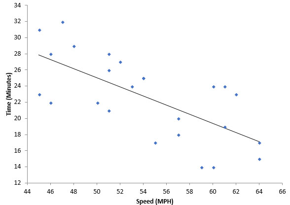
The solid line on the chart is the “best fit” line which will be discussed below. There are really three questions to ask at this point:
- Is there a relationship between speed and the time it takes to get to work?
- Is the relationship between speed and the time to get to work statistically significant?
- If the relationship is statistically significant, is it of any use to us in practical terms?
Interpreting a Scatter Diagram
The first question is really answered by looking at the scatter diagram and deciding if there is some sort of relationship. The figures below show the general types of relationships that can exist. Figure 2 shows a positive correlation between X and Y. For example, if you are paid by the hour, the more hours your work, the more pay you received.
Figure 2: Positive Correlation
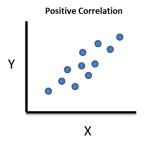
Figure 3 is an example of a negative correlation. A negative correlation exists between variable X and variable Y if a decrease in X results in an increase in Y. For example, the colder it is outside, the higher your heating bill is.
Figure 3: Negative Correlation
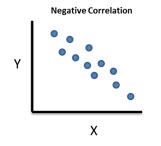
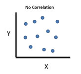
Figure 4 is an example of no correlation. It looks like a shotgun pattern. There is no correlation if a change in X has no impact on Y. There is no relationship between the two variables. For example, the amount of time I spend watching TV has no impact on your heating bill.
Figure 4: No Correlation
Look back at Figure 1. What type of correlation may exist? It appears to be a negative correlation, that is, as speed increases the time to get to work decreases. The first question above has been answered. Of course, we tend to want to put numbers and probabilities to things. We will address the second two questions below.
Is the Correlation Statistically Significant?
There are two parts to determine if the correlation is statistically significant. The first step is to determine the “best fit” equation between x and y. Software today will do that easily for you. If you want to see the math involved, please refer to our publication on regression.
The best fit equation has the form:
y = b0 + b1x
where y is the predicted value of y for a given value of x, b1 is the slope of the line and b0 is the y-intercept (where the line crosses the y axis).
The best fit line for Figure 1 is given by:
y = -0.565x + 53.32
The key number in the equation is -0.565, which is the slope of the line. This gives you the change in y that is caused by a change in x. For every 1 mph faster you go, the time to get to work will decrease by 0.565 minutes on average.
But you can’t just do the best fit line and stop. Any set of data will have a best fit line that can be added to it. It does not mean that the fit is statistically significant. To determine that, you will need to look at the p-value for the model. When you run a regression to determine the best fit line, you will often get output that looks like the following for the speed and time to get to work data.
ANOVA for the Model
| df | SS | MS | F | p value | |
|---|---|---|---|---|---|
| Model | 1 | 287.8 | 287.8 | 19.99 | 0.0002 |
| Residual | 23 | 331.2 | 14.40 | ||
| Total | 24 | 619.0 |
Predictors' Table
| Coefficient | Standard Error | t Stat | p Value | |
|---|---|---|---|---|
| Intercept | 53.32 | 6.885 | 7.744 | 0.0000 |
| Speed | -0.565 | 0.126 | -4.471 | 0.0002 |
To see how this table is developed, please see part 2 of our publication on regression. These help you decide if speed has a significant impact on the time. The top table is the Analysis of Variance for the model. The columns are the degrees of freedom, sum of squares, mean square, F Value and the p value. These are explained in the link above. The key column to look at is the p value. If it is less than 0.05, then the model is statistically significant. In this case, the p value is 0.0002. We conclude that the model is good.
The next table is the Predictors' table. This table provides you the coefficients to use in the best-fit line. b0 is the intercept (53.32) and b1 is the slope (-0.565). The other columns are the standard error, the t statistic and the p-value. Again, the column to look at is the p value. If the values are less than 0.05, then the terms are significant. You can see that both the intercept and the slope are significant since the p values are less than 0.05.
So, the second question has now been answered. The speed does have a statistically significant effect on the time to get to work. Now, for the third question.
Is the Correlation Useful to Us?
If there is not a significant correlation between x and y, the correlation is, of course, worthless to you. But just because a correlation is statistically significant does not mean that it is of any real use to you.
There is another number that often appears in regression output. This number is the R2 value. R2 is given by 1 - SSResidual/SSTotal where SS is the sum of squares in the ANOVA table above. R2 essentially measures the amount of variation in y that is explained by the variation in x.
The value of R2 for the speed and time to get to work data is 46.5%. This means that about 46% of the variation in time to get to work is explained by the variation in speed. So, changing speed does have some impact, but it is not the entire reason that the time to get to work varies.
What value of R2 makes a correlation useful to you? It depends on the situation. To “control” y by controlling x requires a high R2 value – probably 80% or more. But to impact y by controlling x, the value of R2 can be lower, like in the speed and time to get to work example.
Scatter Diagram Example
In a warehouse, pickers pick line items from a pick ticket. Is there a correlation between lines picked per day in a warehouse and overtime hours? The data for the last 22 days are given in the table below.
Table 2: Lines Picked per Day and Overtime Hours
| Lines Picked | Hours Overtime | Lines Picked | Hours Overtime | |
|---|---|---|---|---|
| 599 | 23.5 | 608 | 24.5 | |
| 658 | 28.5 | 653 | 25.5 | |
| 699 | 29.0 | 650 | 27.0 | |
| 738 | 30.5 | 671 | 29.0 | |
| 791 | 31.5 | 606 | 24.0 | |
| 685 | 28.0 | 648 | 25.5 | |
| 656 | 28.0 | 758 | 31.0 | |
| 570 | 24.5 | 712 | 30.0 | |
| 614 | 26.0 | 611 | 25.5 | |
| 684 | 29.5 | 671 | 26.0 | |
| 749 | 30.0 | 651 | 27.0 |
The scatter diagram is given below. This was generated using the SPC for Excel software.
Figure 5: Lines Picked per Day vs Overtime
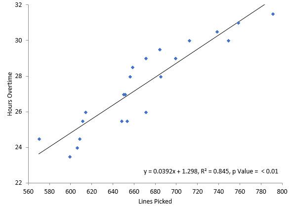
The equation in the graph shows the relationship between lines picked per day and overtime. The equation is:
y =0.0392x + 1.298
where y = overtime in hours and x = lines picked per day. Again, the key number in the equation is the 0.0392. This is the slope of the line. It means that when the line items picked per day increases by 1, the overtime hours will increase by .0392 hours.
The p value shown in the graph is < 0.01. Since this is less than 0.05, there is a statistically significant correlation between overtime and lines picked. R2 is 84.5% which means that 84.5% of the variation in overtime is explained by the variation in lines picked.
You can use this equation to predict overtime based on the number of lines picked per day. For example, if the number of lines picked on a given day was 600, the overtime is predicted to be:
y =0.0392x + 1.298 = (0.0392*600) + 1.298 = 24.82
Summary
This publication has introduced the scatter diagram. A scatter diagram is used to determine the relationship between two variables. There can be a positive, negative or no correlation. Once you make the scatter diagram, there are three questions that must be answered:
- Is there a relationship between x and y?
- Is the relationship between x and y statistically significant?
- If the relationship is statistically significant, is it of any use to us in practical terms?
This publication demonstrated how to answer those questions. If a significant correlation exists, you may be able to control one variable by controlling the other.
Quick Links
Thanks so much for reading our publication. We hope you find it informative and useful. Happy charting and may the data always support your position.
Sincerely,
Dr. Bill McNeese
BPI Consulting, LLC

