May 2011
This month's newsletter on the scatter plot matrix expands on two previous newsletters. It includes an interesting set of data that examines the impact of three variables on the taste of cheddar cheese. There are correlations between each of the three variables and the taste of the cheese, but there are also correlations between the three variables. Please feel free to add comments at the end of the newsletter - perhaps on what you see in the data.
Last month, we looked at correlation analysis, which is a method of determining if a linear relationship exists between two variables. We combined the use of scatter diagrams with the calculation of the Pearson correlation coefficient. This month we will look at how to make multiple scatter diagrams in a technique called the scatter plot matrix. This technique makes it easier to visually see the relationships between several variables at the same time.
In this issue:
- The Cheddar Cheese Data Set
- Types of Correlation Review
- Scatter Diagram Review
- Correlation Coefficient Review
- Correlation Coefficient Table for Multiple Variables
- Scatter Plot Matrix
- Summary
- Quick Links
The Data Set: Cheddar Cheese Taste
Cheddar cheese is a popular cheese. This example involves taking a look at what impacts the taste of the final product. This example is from the statsci.org website that is "a window to statistical science and bioinformatics on the web, with special attention to Australia." This website has a number of datasets that you can use for examples in teaching. Here is a summary of the project:
"As cheese ages, various chemical processes take place that determine the taste of the final product. In a study of cheddar cheese from the LaTrobe Valley of Victoria, Australia, samples of cheese were analyzed for their chemical composition and were subjected to taste tests. Overall taste scores were obtained by combining the scores from several tasters. This dataset contains concentrations of various chemicals in 30 samples of mature cheddar cheese, and a subjective measure of taste for each sample. The variables "Acetic Acid" and "H2S" are the natural logarithm of the concentration of acetic acid and hydrogen sulfide respectively. The variable "Lactic Acid" has not been transformed."
The data are shown in the table below.
| Case | Taste | Acetic Acid | H2S | Lactic Acid |
| 1 | 12.3 | 4.543 | 3.135 | 0.86 |
| 2 | 20.9 | 5.159 | 5.043 | 1.53 |
| 3 | 39 | 5.366 | 5.438 | 1.57 |
| 4 | 47.9 | 5.759 | 7.496 | 1.81 |
| 5 | 5.6 | 4.663 | 3.807 | 0.99 |
| 6 | 25.9 | 5.697 | 7.601 | 1.09 |
| 7 | 37.3 | 5.892 | 8.726 | 1.29 |
| 8 | 21.9 | 6.078 | 7.966 | 1.78 |
| 9 | 18.1 | 4.898 | 3.85 | 1.29 |
| 10 | 21 | 5.242 | 4.174 | 1.58 |
| 11 | 34.9 | 5.74 | 6.142 | 1.68 |
| 12 | 57.2 | 6.446 | 7.908 | 1.9 |
| 13 | 0.7 | 4.477 | 2.996 | 1.06 |
| 14 | 25.9 | 5.236 | 4.942 | 1.3 |
| 15 | 54.9 | 6.151 | 6.752 | 1.52 |
| 16 | 40.9 | 6.365 | 9.588 | 1.74 |
| 17 | 15.9 | 4.787 | 3.912 | 1.16 |
| 18 | 6.4 | 5.412 | 4.7 | 1.49 |
| 19 | 18 | 5.247 | 6.174 | 1.63 |
| 20 | 38.9 | 5.438 | 9.064 | 1.99 |
| 21 | 14 | 4.564 | 4.949 | 1.15 |
| 22 | 15.2 | 5.298 | 5.22 | 1.33 |
| 23 | 32 | 5.455 | 9.242 | 1.44 |
| 24 | 56.7 | 5.855 | 10.199 | 2.01 |
| 25 | 16.8 | 5.366 | 3.664 | 1.31 |
| 26 | 11.6 | 6.043 | 3.219 | 1.46 |
| 27 | 26.5 | 6.458 | 6.962 | 1.72 |
| 28 | 0.7 | 5.328 | 3.912 | 1.25 |
| 29 | 13.4 | 5.802 | 6.685 | 1.08 |
| 30 | 5.5 | 6.176 | 4.787 | 1.25 |
Types of Correlation Review
When comparing two variables to determine if there is a linear correlation, there are basically three types of correlation that can exist as was shown in last month's newsletter.
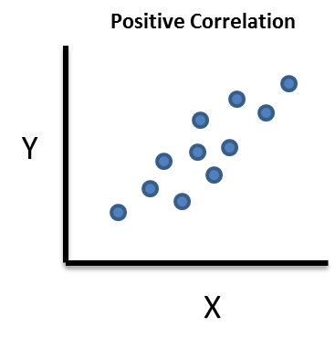
A positive correlation exists between variable X and variable Y if an increase in X results in an increase in Y (and vice-versa).
- The more cigarettes you smoke, the greater the chance of lung cancer.
- If you are paid by the hour, the more hours you work, the more pay you receive.
- The more time you spend studying, the better grades you make in school.
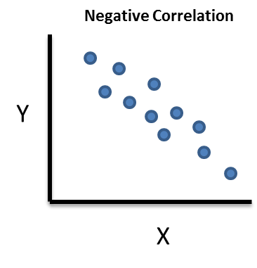
A negative correlation exists between variable X and variable Y if a decrease in X results in an increase in Y (and vice-versa).
- The heavier your car is, the lower your gas mileage is.
- The colder it is outside, the higher your heating bill.
- The more time you spend watching TV, the lower your grades are in school.
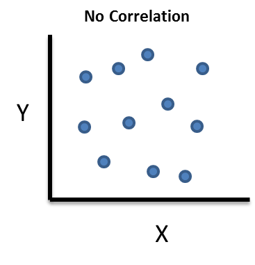
No correlation exists. In this case, a change in X has no impact on Y (and vice-versa). There is no relationship between the two variables. For example, the amount of time I spend watching TV has no impact on your heating bill.
Remember: just because there is a correlation between two variables does not mean that one is the cause of the other. Please refer to last month's newsletter for more discussion on this.
Scatter Diagram Review
A scatter diagram simply plots the Y variable versus the X variable. In the above data, the Y variable is the taste. There are three "X" variables: acetic acid concentration, hydrogen sulfide concentration and lactic acid concentration. One could draw three separate scatter diagrams for the each X variable and its impact on the Y variable. But there are actually more scatter diagrams to consider. What about the relationship between the three X variables? Is it possible that there is a correlation between, for example, acetic acid and lactic acid? What about between hydrogen sulfide and lactic acid? As we will see below, the scatter plot matrix gives us a quick visual look at all possible pairs of correlations.
The scatter diagram for acetic acid versus taste is shown below. It is made by simply plotting the pairs of data for each point. For example, sample 1 had a taste of 12.3 and ln(acetic acid concentration) of 4.543. The 4.543 represents the x variable and the 12.3 is the y variable on the chart below. Sample 1 is highlighted by the arrow in the scatter diagram below. The other data points represent the remaining sample pairs.
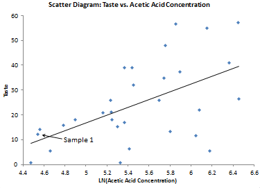
The straight line represents the "best-fit" line based on the data. There appears to be positive correlation between the two. The taste improves as the acetic acid concentration increases.
Correlation Coefficient Review
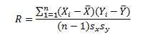
Last month we demonstrated how to calculate the Pearson correlation coefficient. Please review that newsletter for more details. The equation for the Pearson correlation coefficient is:
The correlation coefficient between taste and acetic acid concentration is R = 0.55. If R is positive, there is a positive correlation between the two variables. The closer to 1 R is, the stronger the positive correlation. If R is negative, there is a negative correlation between the two variables. The closer R is to -1, the stronger the negative correlation. There is no correlation if R is equal to zero.
We also showed how to determine the p value for the correlation. The p value between taste and acetic acid concentration is 0.002. This implies that there is a statistically significant correlation between the two variables if our chosen significance level is 0.05.
Correlation Coefficient Table for Multiple Variables
You can develop a table that contains the correlation coefficients for all possible pairs of variables. This is shown in the table below. For each pair of variables, the R value is the top value. The p value is the bottom value.
|
R/p value |
Taste |
Acetic Acid |
H2S |
Lactic Acid |
|
Taste |
- |
0.55 |
0.756 |
0.704 |
|
|
0.002 |
0 |
0 |
|
|
Acetic Acid |
0.55 |
- |
0.618 |
0.604 |
|
0.002 |
|
0 |
0 |
|
|
H2S |
0.756 |
0.618 |
- |
0.645 |
|
0 |
0 |
|
0 |
|
|
Lactic Acid |
0.704 |
0.604 |
0.645 |
- |
|
0 |
0 |
0 |
|
You can see that there is all the R values have a p value less than our significance level of 0.05. This means that all the correlations are statistically significant.
Scatter Plot Matrix
We are now ready to develop the scatter plot matrix. The scatter plot matrix simply plots scatter diagrams between all possible pairs of data and visually displays them so you can quickly see the relationship between the variables.
Suppose you have three variables. There are six possible combinations of pairs of the variables. The scatter plot matrix layout for three variables is shown below.
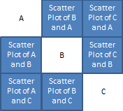
Look at the first row. Variable A is listed by its name. Then, still on row one, the scatter plot between B and A is shown next. B is in the second column. This scatter plot is x vs. y. In this row, A is always plotted on the y axis. The last scatter diagram is of C and A. The second row focuses on variable B. The first plot is another plot of the relationship between A and B, but this time B is on the y axis. You sometimes see a different picture when you switch which factor is on the y axis. It does not change the relationship - it just sometimes makes it easier to see. The process continues for all pairs of variables.
The scatter plot matrix for the taste data is shown below. What do you see?
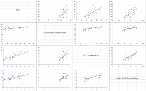
There does appear to be a positive correlation between all the variables. The scatter plot matrix provides a quick visual check on the possible correlations.
The three X variables have significant positive correlations with taste but they are correlated with each other. Does just one of them really influence the taste? Maybe two of them? Maybe all three?
If you are trying to predict a value for Y based on the multiple X variables, you can run into problems if the X variables are highly correlated. This phenomenon is called multicollinearity. It does not reduce the predictive power of the model based on the X variables, but it does make it difficult to understand the contribution of the individual X variables.
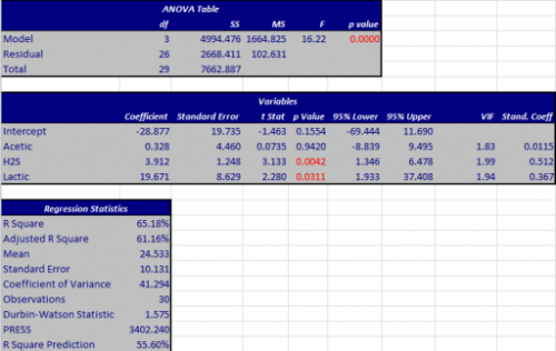
The output from the multiple regression for taste based on the three X variables is shown below. For more information on this output, please see our two part series on linear regression from June - July 2008 at this link. You can see from the results (looking at the p values) that the acetic acid concentration does not add anything additional to the model. The p value for acetic acid concentration is large. The best model is when you include only the H2S concentration and the lactic acid concentration.
Summary
The scatter plot matrix is a great technique for seeing the relationship between pairs of variables. A scatter diagram for every pair of variables is given in the scatter plot matrix. It will give you a quick look at which variables are correlated to other variables and can be a big help in seeing what predictor variables may be correlated in regression analysis
Quick Links
Thanks so much for reading our publication. We hope you find it informative and useful. Happy charting and may the data always support your position.
Sincerely,
Dr. Bill McNeese
BPI Consulting, LLC
![]()
Connect with Us
SPC Knowledge Base

Sign up for our FREE monthly publication featuring SPC techniques and other statistical topics.
Customer Stories
Click here to see what our customers say about SPC for Excel!
SPC Around the World
SPC for Excel is used in 80 countries internationally. Click here for a list of those countries.
Comments (1)
I think your articles are very informative and provide great examples of how to apply statistical approaches to solve problems. It is also beneficial that you use examples from different industry perspectives.
Leave a comment